
Region of Waterloo
Pocket Cards
Overview
This project focused on improving the Region of Waterloo’s website to enhance usability, accessibility, and navigation for local residents. The goal was to simplify how users find information, services, approachable for everyone.
Through user research, usability testing, and iterative design, the team created a more intuitive structure and layout to better serve the community’s needs.
Role
User Experience Designer
User Research, Interaction, Visual design, Prototyping & Testing
Teammates
Isabel Uribe-Perez, Farizah Naeem, Liana Valdez, Jagdeep Singh, Rathesa Kodeeswaran, Daniel Chung, Mohamed Shaffie, Priyanka Baskaran
Duration
4 Months
Background Information
Who is the Region of Waterloo?
The Region of Waterloo is the regional government for the Waterloo area, providing a wide range of public services to residents. They support children, seniors, and individuals seeking jobs, housing, emergency shelter, or financial assistance. In addition, the Region manages public health, transportation, waste collection, and community services that impact daily life. The municipal website plays a key role in helping residents access these important programs and resources.
What are the Pocket Cards?
Pocket Cards are one-page, foldable cards made from water-resistant material. They are designed to provide quick, accessible information about available food and shelter services in the Region of Waterloo. The cards are intended to be easy to carry and useful for individuals experiencing homelessness or those in urgent need of assistance.
Research Goal
Our goal was to explore the best solution for providing quick and easy access to food and shelter information. We aimed to understand the needs of users who rely on these services and identify how the Pocket Cards could be designed or improved to serve them more effectively. Through research and user feedback, we worked to ensure the cards are practical, accessible, and valuable to those who need them most.
UX process
To guide the redesign of the Region of Waterloo’s website, we followed a Double Diamond UX process. We began with research and discovery through user interviews, content audits, and competitor analysis to understand resident needs. From there, we defined key usability issues and prioritized improvements to navigation and accessibility. We then explored ideas through site map redesign, wireframes, and tree testing. Finally, we developed a high-fidelity prototype, conducted usability testing with residents, and iterated the design based on their feedback to create a more user-friendly and accessible website experience.

Understanding the Problem
Many residents of the Region of Waterloo rely on the municipal website to find important services and information. However, the site was difficult to navigate, with a confusing structure, inconsistent content, and accessibility barriers. Users often struggled to locate what they needed or became frustrated with the experience. We wanted to better understand these challenges so we could design a website that is clear, organized, and accessible for all users.
Target Audience
Residents of the Region of Waterloo, including individuals of all ages, abilities, and backgrounds who use the website to access municipal services and information.
Goal
To redesign the Region of Waterloo’s website to improve usability, accessibility, and overall user experience ; helping residents easily find the information and services they need.
Gathering Insights
We conducted research to better understand how people currently access food and shelter information, and what challenges they face. Through conversations with community members and service providers, we learned that many users need information that is quick to find, simple to read, and easy to carry in all conditions. Feedback highlighted the importance of clear contact details, up-to-date resources, and durable materials. These insights helped us focus on making the Pocket Cards as practical and user-friendly as possible.

To better understand the needs of people using the Pocket Cards, we created a persona named Luke. Luke represents an individual who has been homeless for several years and faces daily challenges in finding food and shelter. His frustrations with the Pocket Card included outdated information, small text that was hard to read, and a lack of clear details. By focusing on Luke’s goals: staying safe, warm, and fed, and considering his additional traits such as anxiety and poor eyesight, we were able to design improvements that make the Pocket Card more accessible, trustworthy, and helpful for people in similar situations.
Journey Map

We created a journey map to better understand the experience of someone trying to use the Pocket Card to find food. The map highlights key steps, from feeling hunger and retrieving the card, to searching for information, visiting locations, and finally finding a place to eat. Through this process, we identified several pain points: confusion due to outdated information, feelings of frustration and desperation when locations were closed, and the challenge of navigating too much information when in an urgent state. These insights emphasized the need for Pocket Cards to be clear, up-to-date, easy to read, and reliable; especially for users in stressful situations.
Early Findings & User Feedback
Our early research revealed that while the Pocket Card is an important resource, users faced several challenges with its current design. The information was often outdated, difficult to read, and not detailed enough to help users in urgent situations. Through user interviews, journey mapping, and persona development, we learned that individuals like Luke need clear, accurate, and easy-to-navigate information, especially when they are stressed or in crisis. Volunteers and social workers also emphasized the importance of having up-to-date cards so they could confidently share them with those in need. These insights guided us toward key improvements: simplifying the layout, increasing readability, and ensuring the information stays current.
Original Pocket Card

Sketches/Ideas


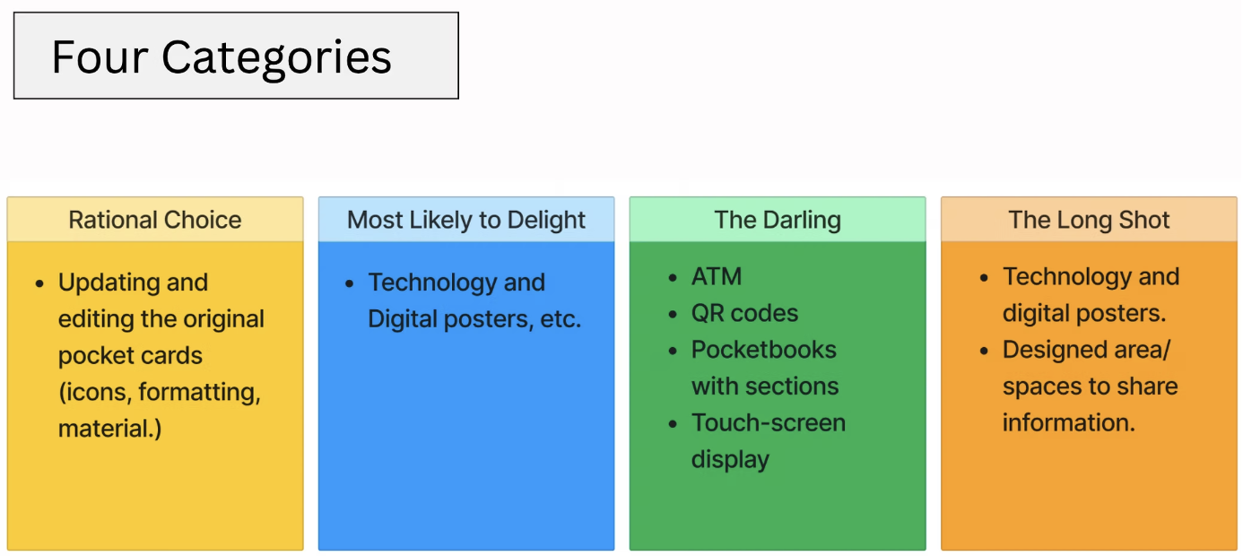
After gathering user feedback and identifying key pain points, we moved into ideation. We used brainstorming sessions, sticky note exercises, and storyboarding to explore ways to improve the Pocket Card’s design and content. Our focus was on making the card more readable, easier to navigate, and more portable for users in urgent situations. We also reviewed samples of existing Pocket Cards to better understand what worked and what needed improvement. This early design phase helped us generate ideas for clearer layouts, improved categorization of services, and better visual hierarchy to support quick decision-making.

Solution

Ideation

Storyboard

Low-Fidelity Prototype


Usability Testing & Findings
We conducted usability testing with four students and one member of the People’s Action Group (PAG). The goal was to observe how users interact with the low-fidelity pocket card and identify areas for improvement. We designed realistic test tasks (such as finding a place to eat or sleep) to simulate actual scenarios users may face. The testing helped us better understand how quickly users could locate information and whether the card met their needs under stress or urgency.

Priority 1
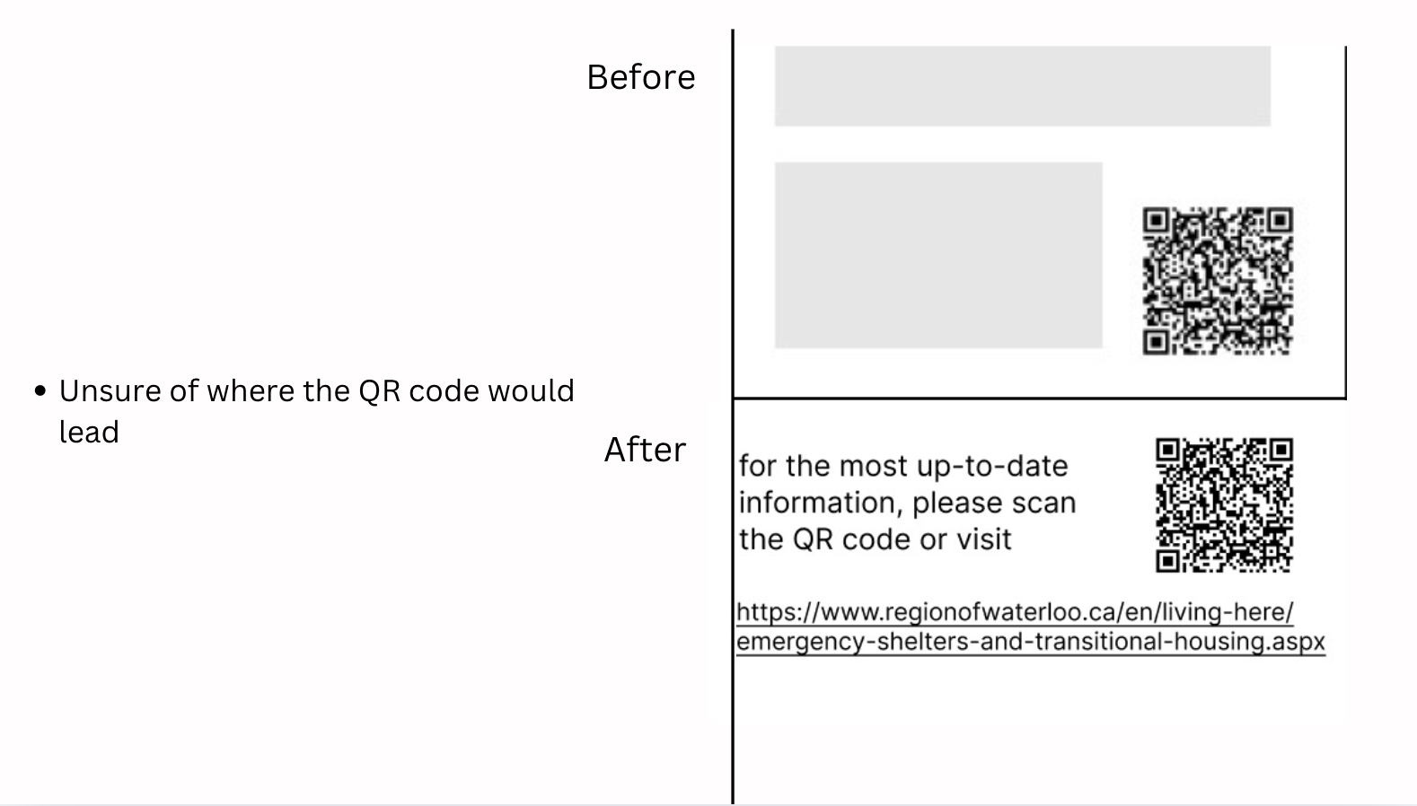
From the usability testing, a few priority issues became clear. Users found the text size too small, making it difficult to read, especially for those with vision challenges. Additionally, the QR code caused uncertainty, participants were unsure of where it would lead or how to use it. These insights guided us to focus on improving readability and clarifying the purpose and destination of interactive elements like the QR code.

Priority 2
During testing, users found the small text size challenging to read, especially in stressful situations. This was a key accessibility concern, particularly for users with poor eyesight or cognitive fatigue. Additionally, users were unsure about the purpose of the QR code and where it would lead. It became clear that both the readability and the clarity of interactive elements needed improvement for the card to be effective in real-life scenarios.

Medium-Fidelity Prototype

